This morning a good friend of mine, who owns a bath and body company, called me for advice regarding an issue with the production of the labels for her products. When she first approached her vendor for an estimate, she provided physical samples of her product (other labels, printed by a different vendor) that were the exact size and material she wanted quoted. Her labels have a rounded corner, which the vendor failed to notice was a different size than the die (shaping tool/machinery) they use. Today, in the midst of proofing her labels, her vendor told her the die size they use for rounded corners (.125”) is the “industry standard“ and if she wants to maintain the size on the rounded corners she submitted, she’ll have to pay an additional $400 to have a new die created. What? Ugh. She already paid a designer to adjust the size of the corners and now, she ‘s stuck in a tough spot. Is it the vendor’s fault for not noticing and not mentioning the difference to her during the estimating process? Is there anything she could have done to prevent this?
CONSIDER THIS… when estimating projects that require die cuts (or rounded corners). An ounce of prevention is worth a pound of cure in these situations. The following suggestions also help to keep the costs down:
Ask your vendor if they handle die cutting and conversion in-house or if they outsource it. If they handle it in-house:
1) Request a full-sized, digital die line file from your vendor.
2) Measure it.
3) Transfer the die line to your design file and use as your guide for design.
4) Print it.
5) Create a mock up.
6) Test it.
If they are outsourcing the die cutting or conversion:
1) Ask them to double check their vendor’s current library of dies and ask them to send you the most recent version of that die line.
2) Then, follow steps 1-6 above.
We ran into a similar issue with our envelopes during the Murphy’s Law project. Our print vendor provided us with the last die he was given by their envelope converter. When we went to print the envelope, the converter had updated their dies. The new file was slightly different than the file we received. Ultimately, we had to adjust the design to fit the new die. A luxury we had but one my friend does not.
Something as simple as the size of a rounded corner, or the angle of an envelope flap, can have a big impact on the final outcome of the image. For every element and every design decision that’s made, pay close attention, ask questions of your vendor, and go into every job filled with as much knowledge as possible. Hopefully, by doing so, you can avoid extra costs and the pitfalls of missed details.
Monday, June 8, 2009


Monday, June 1, 2009
NEW ADDRESS PLACEMENT REQUIREMENTS for flat sized mail pieces
Another detail in the endless realm of design details...
I'm putting out a miniature fire today.
Recently the post office created new address placement requirements for flat sized mail pieces (i.e magazines and mailers). I don't recommend dealing with these issues when your project is about to be plated but... hey, looks like we're in luck today!
So... to spare you the embarrassment and cost (!) make sure to bookmark this blog or check out the new requirements for flat sized mail pieces -
http://www.usps.com/mailpro/2008/mayjune/page8.htm.
as well as information on design requirements in general -
http://pe.usps.com/mpdesign/mpdfr_intro_all.asp
If you have further, in depth questions about designing items to be mailed, search and find your very own Mailpiece Design Analyst here: http://pe.usps.com/mpdesign/mpdfr_mda_lookup.asp (pretty cool).
For those of you in San Diego...
Paula Bigornia - Mailpiece Design Analyst
United States Postal Service
11251 RANCHO CARMEL DR RM 145
SAN DIEGO CA 92199-9602
Phone Number: 858-674-0392
Fax Number: 858-674-0055
Email Address: paula.m.bigornia@usps.com
Happy designing!
I'm putting out a miniature fire today.
Recently the post office created new address placement requirements for flat sized mail pieces (i.e magazines and mailers). I don't recommend dealing with these issues when your project is about to be plated but... hey, looks like we're in luck today!
So... to spare you the embarrassment and cost (!) make sure to bookmark this blog or check out the new requirements for flat sized mail pieces -
http://www.usps.com/mailpro/2008/mayjune/page8.htm.
as well as information on design requirements in general -
http://pe.usps.com/mpdesign/mpdfr_intro_all.asp
If you have further, in depth questions about designing items to be mailed, search and find your very own Mailpiece Design Analyst here: http://pe.usps.com/mpdesign/mpdfr_mda_lookup.asp (pretty cool).
For those of you in San Diego...
Paula Bigornia - Mailpiece Design Analyst
United States Postal Service
11251 RANCHO CARMEL DR RM 145
SAN DIEGO CA 92199-9602
Phone Number: 858-674-0392
Fax Number: 858-674-0055
Email Address: paula.m.bigornia@usps.com
Happy designing!
Friday, May 22, 2009
Tweet Tweet.
It took a while to convince myself but, what the heck.
You can follow me here now too: https://twitter.com/FabrcationMastr
You can follow me here now too: https://twitter.com/FabrcationMastr
Wednesday, May 20, 2009
Amazing color tool!
I received this recommendation from kimtb as a supplement to my post on color. She has a GREAT design blog on wordpress. http://redesignblog.wordpress.com/ - check it out!
And then... check this out.
http://labs.ideeinc.com/multicolr/#.
I think one could get lost on that Web site for hours!
And then... check this out.
http://labs.ideeinc.com/multicolr/#.
I think one could get lost on that Web site for hours!
Monday, May 18, 2009
CMYK vs. PMS
 CMYK vs PMS. Such fun. ;~)
I was inspired by fellow blogger, Mark Reyland (Just My Opinion), who took on the subject of PMS and CMYK color and how it relates to packaging and product design choices.
He's right, the majority of projects printed on offset presses use the CMYK method of printing.
CMYK is also referred to as 4-color process or process colors. The ink lays down on the paper one color at a time (C = Cyan, M = Magenta, Y = Yellow and K = Black) in miniature dots. The colored dots combine to create an image. This type of printing is typically used whenever photography or illustration is used in graphic design.
 The Pantone Matching System aka PMS is also referred to as spot color. Spot color is used primarily when it is imperative to match (nearly exact) color for a particular brand (i.e. as in the case with pro-sports teams or brands that are renowned for using particular colors). It is a solid color and is used a lot on letterhead, business cards, and jobs where the design doesn't include photography or imagery with a blend of color.
You can save money by using PMS colors if you use less than 4 colors. A nifty trick is that you can use transparencies of a color (i.e. reducing the transparency of a color can provide a wide gamut of tints), and you're literally only using one color on press. As you can see below, one color can yield a variety of "colors." Black transparencies have grey tints, red transparencies tinge pink.

PMS and CMYK printing is not the same.
PMS is broken down into PMS C vs. PMS U (colors appropriate for Coated sheets vs. Uncoated sheets of paper). Selecting the color depends on your paper choice.
And while there is a way to convert color from PMS to CYMK and vice versa, it is difficult to match a PMS color exactly when printing using CMYK. The transition just doesn't translate very well.
Printers can also mix PMS colors to create custom colors. Of course, this is not as cost effective as just choosing one from the PMS book.
One of my absolute favorite books, since I became engaged in this industry, is Leatrice Eiseman's - The Pantone Guide to Communicating with Color. She goes into great depth re: color, symbology, meaning, and emotional connection. She also breaks down PMS color combinations that work well in unison.
Here's some fun with colors and their meanings: (I pulled these off of fellow blogger Dyango Chavez's blog at http://dyangochavez.blogspot.com/2007/03/some-colors-and-meanings.html)
- Red: This is the hottest of the colors. It is energetic, full of life, vibrant and active. It is also one of the most visible colors. It is associated with passion, life, masculinity, energy, danger, anger, blood, fire and power.
- Blue: This is a cold color. Dark blue has been associated with intelligence, stability, trust, depth and intellect. It is also the most calming and relaxing of the colors.
- Green: This is also a cold color. It symbolizes health, nature, freshness, harmony and balance. It has been associated with money, spring and stability.
- Orange: This is a warm color and very stimulating. It is associated with joy, vitality, creativity and energy. It is used to symbolize construction and is a great action trigger. It has been said to increases the craving for food.
- Purple: This color can be cold or warm, depending on the amount of blue or red used in the mix. It is symbol of spirituality, luxury, royalty and power. In some cultures is also associated with disease.
- Yellow: This is a warm color associated with energy, light, happiness, energy, creativity and the sun.
- Black: This can be warm or cold, depending on the colors with which it is combined. It symbolizes elegancy, sophistication and mystery. In some cultures it is also a symbol of death.
The whole world, as we experience it visually, comes to us through the mystic realm of color. - Hans Hofmann -
Enjoy.
Wednesday, May 13, 2009
A Nifty Little Resource
Ooooh, I found a new toy.
For those of you who are verbivores, you have probably noticed the banner ads for the visual thesaurus on the thesaurus.com Web site.
Lucky me, our Head Honcho offers his employees a generous stipend each year, which we can spend on nifty little resources such as this one. Since I wear many hats at MORRIS, one of which includes writing proposals (and a blog!), this tricky gadget certainly comes in handy.
Check out the tutorial and give the visual thesaurus a whirl!
http://www.visualthesaurus.com/
For those of you who are verbivores, you have probably noticed the banner ads for the visual thesaurus on the thesaurus.com Web site.
Lucky me, our Head Honcho offers his employees a generous stipend each year, which we can spend on nifty little resources such as this one. Since I wear many hats at MORRIS, one of which includes writing proposals (and a blog!), this tricky gadget certainly comes in handy.
Check out the tutorial and give the visual thesaurus a whirl!
http://www.visualthesaurus.com/
Thursday, May 7, 2009
CONSIDER THIS...
As I began compiling a list of items to consider when working on print specifications, my mind began to swirl (comparable to the effect of the Neave Strobe) at the length of possibilities inherent in each project.
We have skimmed the surface of paper and have even discussed certain press considerations but to gain a further and more complete understanding of the complexity of this process, I have decided to break it down into smaller categories. I plan to post these considerations intermittently and will title each section "CONSIDER THIS..."
Sooooooooooooooo .... CONSIDER THIS... when printing large format items (such as banners, signs, walls, billboards, car and building wraps, standees, etc.)
1) Find a great vendor who specializes in large format printing. If you can find a vendor who has various capabilities, provides stellar service, a quality product at a decent price, and uses cutting edge materials, even better! Request samples of their products and ask lots of questions!
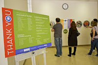
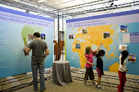
I had the privilege of working with an amazing, large format vendor recently on an installation MORRIS did for the La Jolla Country Day School. This exhibit required a variety of items including large signage, standees (life size cut outs), banners, large walls, clings, street post signage, and magnetic items.
Our vendor, Avi Klinger, owner of Sign It (www.sign-it.com), fit every description listed above. He worked side by side with us on this project every step of the way. He provided personal attention and material samples, brainstormed ideas with us, kept an open and experimental mindset, and his company had the capability of producing EVERYTHING we requested QUICK. Check out the amazing products they produced below (signs, walls, magnets, doors, and standees).


2) Verify the maximum size of the press. Take bleed (color running off the edge of a page) into consideration.
3) Request specifications from your vendor re: file set up and delivery. Knowing how to set up and save your file ahead of time is a crucial, time-saving step.
CONSIDER THIS... when printing banners, large signs or walls (such as trade show graphics) or billboards:
1) Determine the purpose of your banner/sign/wall/billboard. The purpose drives the overall design.
We created several outdoor banners for the installation mentioned above. The purpose of these banners was to inform the public about the upcoming exhibit. They were hung on chain link fences outside of the school for approximately two weeks. We chose a sturdy, weather resistant, vinyl material and used grommets and zip ties to hang the banners. We also selected large, white type that was set off by beautiful bright colors, to catch the attention of drivers as they sped by.
Example :: Indoor Banners
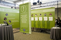
We also created several indoor banners for the exhibit. The purpose of these banners was to announce each separate part of the installation. They were hung from the ceiling on wire cords inside the show for approximately one week. We chose a recycled, lightweight material and used a pole/pocket system to hang the banners. Because the banner was double sided and hung via poles, we had to account for additional banner length (so they could fold and sew the material to create a pocket for the pole) and we were instructed to mirror our design on the bottom portion of the banner to accommodate for the double sided feature. The designs for each of the six banners were branded consistently. They worked in unison, as a family, that helped successfully represent each department of the exhibition.

I remember a meeting where our client was asking us for advice on producing a banner. After walking her through the questions listed above, I can still hear her laughing as she replied, "Who would have thought, ALL THIS went into a simple banner?" I think she chose silver grommets. ;~)
We have skimmed the surface of paper and have even discussed certain press considerations but to gain a further and more complete understanding of the complexity of this process, I have decided to break it down into smaller categories. I plan to post these considerations intermittently and will title each section "CONSIDER THIS..."
Sooooooooooooooo .... CONSIDER THIS... when printing large format items (such as banners, signs, walls, billboards, car and building wraps, standees, etc.)
1) Find a great vendor who specializes in large format printing. If you can find a vendor who has various capabilities, provides stellar service, a quality product at a decent price, and uses cutting edge materials, even better! Request samples of their products and ask lots of questions!
I had the privilege of working with an amazing, large format vendor recently on an installation MORRIS did for the La Jolla Country Day School. This exhibit required a variety of items including large signage, standees (life size cut outs), banners, large walls, clings, street post signage, and magnetic items.
Our vendor, Avi Klinger, owner of Sign It (www.sign-it.com), fit every description listed above. He worked side by side with us on this project every step of the way. He provided personal attention and material samples, brainstormed ideas with us, kept an open and experimental mindset, and his company had the capability of producing EVERYTHING we requested QUICK. Check out the amazing products they produced below (signs, walls, magnets, doors, and standees).


2) Verify the maximum size of the press. Take bleed (color running off the edge of a page) into consideration.
3) Request specifications from your vendor re: file set up and delivery. Knowing how to set up and save your file ahead of time is a crucial, time-saving step.
- What are the accepted file formats (Illustrator, Photoshop, InDesign, pdf, tif, jpeg... etc.)?
- What resolution should you build the file?
- How should you build the file (CMYK)?
- What is the live area?
- Should you outline the fonts?
- Should you embed the images?
- Do they have an ftp site?
- Would they like the file delivered on disc?
- Would they prefer you upload online through their Web site?
- What material is appropriate for this application?
- Do they have recycled materials?
- What are the newest materials on the market?
- Are they available?
- How long will it take to get them?
- What is the weight of the material?
- Is the weight of the material appropriate for this application?
- What is the turnaround on the item(s)?
- Do they provide proofs?
- Is there an additional cost for proofs?
- Can you get a sample printed on the material you requested?
- Is there an additional cost for a sample?
- Can you attend a press check?
CONSIDER THIS... when printing banners, large signs or walls (such as trade show graphics) or billboards:
1) Determine the purpose of your banner/sign/wall/billboard. The purpose drives the overall design.
- Is it a backdrop at a trade show?
- Is it intended to draw attention to an event or company as drivers pass by?
- Is it used as a sign in an art installation?
- Are you using a stand?
- Are you hanging it on a wall, on a fence?
- Will it be hung on existing hardware (such as a billboard or banner stand)?
- Will the existing hardware support the weight of the banner/sign/wall/billboard?
- Do you want grommets? If so, what color?
- Do you want to hang this using a pocket/pole system?
- What type of hardware do you need to hang your banner (hooks, zip ties, wires, poles, glue, special services, etc.)?
- Where will you hang your banner/sign/wall/billboard? Inside? Outside?
- If you are hanging your banner/sign/wall/billboard outside, for how long?
We created several outdoor banners for the installation mentioned above. The purpose of these banners was to inform the public about the upcoming exhibit. They were hung on chain link fences outside of the school for approximately two weeks. We chose a sturdy, weather resistant, vinyl material and used grommets and zip ties to hang the banners. We also selected large, white type that was set off by beautiful bright colors, to catch the attention of drivers as they sped by.
Example :: Indoor Banners
We also created several indoor banners for the exhibit. The purpose of these banners was to announce each separate part of the installation. They were hung from the ceiling on wire cords inside the show for approximately one week. We chose a recycled, lightweight material and used a pole/pocket system to hang the banners. Because the banner was double sided and hung via poles, we had to account for additional banner length (so they could fold and sew the material to create a pocket for the pole) and we were instructed to mirror our design on the bottom portion of the banner to accommodate for the double sided feature. The designs for each of the six banners were branded consistently. They worked in unison, as a family, that helped successfully represent each department of the exhibition.


I remember a meeting where our client was asking us for advice on producing a banner. After walking her through the questions listed above, I can still hear her laughing as she replied, "Who would have thought, ALL THIS went into a simple banner?" I think she chose silver grommets. ;~)
Subscribe to:
Posts (Atom)





 Posts
Posts

