Wednesday, March 9, 2011

Red and White—A Thrilling Combination!


Recently, I attended the Printing Industries of America Trade Show in San Diego. Each year, businesses in our industry gather to tout their wares and each year, I look forward to attending to see what's new.


I visited the Neenah booth, where our rep, Jill Dunleavy was present. We chatted for awhile and then, she handed over the pièce de résistance.

Wow. Wow. Wow. Did I say wow?

Having been through a crazy process trying to figure out how to print white ink on a colored stock, the answer to that dilemma came in the form of her new business card.

A RED PEPPER Classic Linen Digital 100#C printed digitally—on the HP Indigo—with WHITE ink. Niiiiice. This photo doesn't do the crispness (or whiteness) of the printed type justice but, it'll give you the idea.


Not only has this feat become obtainable(!), it can be produced economically! Awesome. Simply awesome.

And, shortly after I shared her card with everyone in the studio, one of my co-workers pointed THIS fabulousness out in this months edition of Print. Printed using the Indigo on Neenah Esse Digital 105#C Pearlized Silver Smooth. Way cool.

Ahhhh, the possibilities.


Thursday, January 27, 2011

Have a production problem? I have a solution!

Do you have a vision? We can get there. Together.

One of our long-term clients hired us to create a set of printed pocket guides for an exciting new product launch. Besides designing a piece that clearly communicated the camera's features and benefits, there were two specific production requests:

1) The guides needed to be the same size as the cameras.
2) The guides needed to feel like the cameras.

For the design, we decided on a special die-cut cover that replicated the cameras exact
size and true-to-life features. We incorporated a special varnish technique (spot gloss UV juxtaposed next to a dull UV) to make the lenses and screens "pop."

The interior show
cased a concise layout with beautiful photography—expressing the cameras capabilities clearly.

As for finding a solution to the "feel" part of this request, embossing was out of the question because the impression would affect the design on the other side. I remembered a printed sample we received from EarthColor Houston that featured a double layer of gloss UV varnish. When you apply two layers of varnish, it thickens the coverage and creates a texture without affecting the design on the other side. It was the perfect solution!

Here's how the designer set up the spot gloss UV layer in the file (double-thick spot UV indicated in magenta):


And here is the final product!


Hugs and big smiles speak volumes, and for these projects, I got both. There's nothing like a happy client!

Tuesday, January 11, 2011

Happy New Year + Print Inspiration

Hope this blog post finds you well on your way to many successes in year 2011! Thanks for your support along the way and for reaching out, offering suggestions and keeping me in check in 2010. I'm grateful to connect with such a passionate group of people in the printing and design industries.

Since I've been busy getting back on track with my schedule, routine, etc., today, I wanted to share a great video, produced by Visual Inclination, that takes you through a custom job from start to finish. I learned a bit myself, watching it! Enjoy.

Print Craft from Visual Inclination on Vimeo.

Monday, December 6, 2010

The H Pad—Here to stay! Should be called the Hilarity Pad!!


I found myself laughing out loud as I was viewing this video. SO TRUE! The H Pad, here to stay! This video was retweeted on twitter by the fabulous
@SandyHubbard (via @JohnKyp), who, besides calling me from Portland, Oregon to offer suggestions for my blog (I was totally blown away), has, along with fellow print professionals, created a hash tag on twitter titled #HelpPrintThrive as a way to support print in all it's venues.

I'm on board! Along with it's history and culture, I still view print as an important, viable industry and vital part of our lives.

Check out this hilarious video!! I love it!

Friday, December 3, 2010

Pretty darn close to offset quality at a digital price

Happy December! Hope you had your fill of gratitude and goodness over the Thanksgiving holiday!

The last time we printed business cards for MORRIS, we went through quite the rigamarole (for more on the learning experience, see part 1 of Murphy's Law here and part 2 here). And, every time a new employee graced our doorstep, it cost us a small fortune to print new cards. Knowing this, I took a fresh approach when our agency recently refreshed our brand and business cards.

For a long time, we have been printing our case studies on a digital HP Indigo press. This particular digital press is not only unique in it's hybrid-like technology but in it's print quality as well. I would have to say, quite honestly, there's no comparison when it comes to quality. The Indigo pretty much kicks ass over all other digital presses and is a GREAT option for nearly-offset-quality small runs at a digital price.

Like all digital presses, there are limitations to the Indigo. Finished size is constrained to 11" (h) x 17" (w) and you have to choose from Indigo approved digital papers (which include a broad range of options) but for projects such as business cards, greeting cards and minimal-paged documents at low quantities (that don't exceed the size specifications), it's truly the best bet.

But shop around. Not all vendors have an Indigo. My recommendation, in the San Diego area, is SOS Printing. Beyond their experienced team and a press that is calibrated close to perfection, they produce high-quality products at extremely competitive prices. You can get to know their digital pressman, Kent Wright (aka rocking' guest blogger), here.

Trust me on this one. You won't be disappointed!

Sunday, October 3, 2010

Absolutely INKcredible!!

Thanks to my friend, Kim Tackett, for sharing this video on her amazing design blog: http://redesignblog.wordpress.com/ Who would have thought that blending ink was so complex?! Much respect to these folks!!

Thursday, September 30, 2010

Have you hugged your vendor lately?

I can happily report that we've had several print projects through our doors recently—thanks to our great clients, Northwestern University in Qatar and Sony Electronics.

Some have gone stupendously! Some, not so great.

For the stupendous jobs, we get hugs (!) and accolades. For the not so stupendous jobs, well, those typically involve a lot of conversations. Client to agency, agency to vendor, vendor to agency, agency internally, agency to client—until we reach a resolution.

What clients remember is the last job—which is why quality, excellent service, and a willingness to collaborate when things go south must be non-negotiable.

Having a good relationship with your vendors and clients is the difference between resolution and absolute frustration. The extent of the relationship you develop with them will come into play in situations that are less than desirable.

Try as you may to print the perfect job, the print process is not perfect—in fact, there are a lot of variables. From photo quality to image resolution and saturation to your paper and varnish selections to the quantity you’re printing to the way the press sheet is laid out, each of these elements has an effect on the final product.

Your vendors are, officially, the last guys on the totem pole and, when a job's not done right, unfortunately, it negatively affects a clients opinion, which, depending on the severity of the mistake(s), could ultimately result in loss of a client—not good!

Do your vendors have a proven track record? Do they do good quality work? Do they keep on top of your jobs? Do they work to meet your needs? Do they collaborate and problem-solve issues when they arise? Do you feel comfortable expressing your disappointment when things go awry?

If you answered no to more than 2 of the questions, perhaps it’s time to reevaluate the people you’ve chosen as your partners. Bottom line, if they fail, you fail. You are only as good as the vendors you choose.

Trust is as important in business as it is personally. Put yourself in good hands, you won’t regret it.

Tuesday, July 27, 2010

Urban Inspiration—Shepard Fairey in South Park

On Sunday morning, I had a delightful breakfast at Alchemy (in South Park, San Diego) with a good friend of mine. During breakfast, she mentioned that Shepard Fairey (of Andre the Giant OBEY and Obama HOPE poster fame) had recently completed a new mural in the area so, we packed up the munchkins and went for a walk.

Lovely. Absolutely lovely.

Yeah, San Diego has beautiful weather, but above all, the culture and people here are really quite amazing. I regularly run across Urban Inspiration that fills my senses in the most wonderful ways.


Tuesday, July 20, 2010

TOP TEN TIPS FOR PREPPING PERFECT FILES FOR PRINT!

by Kent Wright from the Digital Prepress Department at SOS Printing.

You know that 1:7 year ratio for dogs (i.e., if your dog is 3, his "actual" age translates to 21 in human years)? Using that analogy, what do you think the ratio might be for changing technology? For every one year that passes, how many years do you suppose we are evolving technologically? Maybe 1:10, or even 1:15?

The technological speed of change will continue to surge forward at a rapid rate, particularly in the area of Digital Printing and file preparation for print. And although the capability of designers is much better than earlier days, there's always room for improvement.

Quick History Lesson
When I began in the Printing business, computers really weren’t a part of the Prepress manufacturing process. Film strippers worked with line art film shot on horizontal cameras. They laid registered separations onto film flats and finally, composed them into 4 color separations (C, M,Y, K).

Next came the desktop revolution and although exciting, it took a while to actually see a Macintosh computer in the Prepress production environment. When they finally did show up, that’s when the fun started.

Before we go too far though, I do want to introduce you to (if you are not already familiar with) an acronym in the Prepress world called RIP or Raster Image Process because this is very important to us prepress folks. If your files will not “RIP”, as we say, then we cannot produce your job effectively.

"RIP—raster image processing [verb] or raster image processor [noun]—is the process and the means of turning vector digital information such as a PostScript file into a high-resolution raster image. The RIP takes the digital information about fonts and graphics that describes the appearance of your file and translates it into an image composed of individual dots that the imaging device (such as your desktop printer or an imagesetter) can output.

Think of the RIP as a translator between you and your printer. You give it instructions in the language of your desktop publishing application (Photoshop, InDesign, Illustrator, Quark, etc.) and the RIP translates your instructions into the language of the printer. If your language is too complicated for the translator or it misunderstands your instructions the file doesn't RIP." Source: http://desktoppub.about.com/cs/rip/a/rip.htm

Due to increased computer processing power and better software, RIP's don't fail as much as they used to, but jobs still do go sour. Understanding how a RIP processes your files can be the key to successful output. It is also the purpose of this list.

Here is my TOP TEN FILE PREP CHECKLIST to help ensure a quality output print job.

1. Image Resolution
Images should be—at a minimum—set at 300 dpi scaled to 100% for quality output. I am still amazed even now in 2010, how many jobs come in with images set at 72 dpi and scaled up to print larger. This will not work for printing because you will only see pixels at that scale factor and that is not a pretty sight.

2. Image Scaling
Please scale your images prior to placing in the page application program. Along with resolution, try and make sure your images are close to the size you want them to print before placing them on the page. If you attempt to scale an image to 25% for example, you are asking the RIP to do the scale for you. I can tell you from experience, Photoshop’s smooth scaling capability is much better than any RIP.

3. Fonts
Always include the fonts you used for the document you want to print. All applications now have the capability to collect or package all the fonts and the links into a single folder for easy submission to the printer. By the way, if your application gives you a message saying "missing images" while collecting… please correct. If not, I will be calling you! Please do NOT stylize fonts within an application. Make sure you supply that particular variation of any font you use.

4. Page Bleed
Please confirm your pages have any bleed dragged to 1/8” on all 4 sides of the page as applicable. Furthermore, while creating bleed make sure that your created windows actually butt to one another as applicable. If they do not, then you will see gaps in between your pictures.

5. Design your file in the correct program.
Don’t design your entire catalog in Photoshop! Instead, use a page application program like InDesign or Quark which are suited for that purpose. Photoshop is for picture or pixel manipulation and Illustrator is for creating vector illustrations.

6. Design with the correct number of colors in mind.
Many times designers start a project with their application color palette full of practice colors or “maybe colors” they used while designing a particular piece. When you are ready to submit that same document to the printer, please delete those unused colors out of your palette before submitting. Furthermore, if your document is only CMYK, then please change all your active colors used to CMYK so they don’t end up as spot at the printer.

7. Run a spell check before you release your file.
You would be amazed how many times we find a word in a medical document that should be right, maybe right, but who knows? Because it’s not a word we use every day. Please double check beforehand so we can be at peace.

8. Image Density
Here is a scientific fact you should know: It is IMPOSSIBLE to print on any press at 100% of all 4 process colors simultaneously. Why? Because it is difficult to get ink to stick to itself. Knowing that, remember to check your incoming images in the shadow areas what the max density is beforehand. The file should be no more than 320% total max density for optimum print results.

9. Please create document to actual/single page size…NOT spread size.
If your finished size is 8.5" x 11" make sure your page is created to that size. Do not make your page size the actual spread size of both pages. Your printer will take care of where the pages need to go to make them paginate properly.

10. Die Cutting
If your project has a die cut as a part of the finishing process, remember to place the die cut as a layer within the page layout program you are working. Label the layer die cut and change its color to one NOT used in the document.

Thanks and gratitude to Kent Wright from the Digital Prepress Department at SOS Printing. I requested war stories and I received a guest blogger!

For more information on SOS Printing and their digital and offset printing capabilities, you can find them online at http://sosprint.com/ or:

SOS Printing
8135 Ronson Road,
San Diego, CA 92111
P: 858.292.1800
F: 858.279.0687
F: 858.292.8009
E: sosprinting@sosprint.com

Thursday, June 17, 2010

IGTR!!

Tomorrow, MORRIS is having our first ever FedEx day. Inspired by Daniel Pink’s book Drive, FedEx Day can be described as a day of creation, where you start with an idea that intrinsically motivates you, and you make that idea a reality by the end of the day. Thus the FedEx reference—deliver in a day.

I’m particularly excited about the opportunity, because not only do I relate to and LOVE Daniel Pink’s philosophies, I’m stoked to have the opportunity to create something. And I’m stoked for two reasons.

First, I’ve always considered myself a good left/right brain combination. Lately, my work has been skewed towards the left and it’s been FOREVA since I drew something. I find that process to be cathartic and my idea, well, I think it’s kinda cool and ultimately, it could become a product for MORRIS, which I’m all about too. Anything innovative sparks passion in me.

Second, how lucky am I to work for an agency where our head honcho is willing to shut down for a day and allow us to do something we’re passionate about? I know it’s cliché, but I truly do count my blessings when it comes to my employment. Not only because the leadership at MORRIS was resourceful enough to keep us afloat during tough economic times, but also because I can’t remember a time or a job where I have learned so much, both personally and professionally. It’s because of the environment and the LACK of direction my boss, Steve Morris, has provided, that has enabled me to be self-directed and grow so much.

So, while I’m not at liberty to discuss my project—yet—let’s just say IGTR!

Font Issue

Tuesday, June 1, 2010

The Pièce de Résistance... a Handwritten Thank You Note

Upon completion of a project, take the time to think about all of the people who participated in the job—from your client(s) to your vendor(s) to the folks in between.

Keep the big picture in mind and remember, without those people, either your job wouldn't exist, or you'd have a tough time getting it done alone.

It's our practice at MORRIS to send handwritten thank you cards to our client(s), vendor(s) and all those who have helped us along the way.

Showing your appreciation for the people who choose to work with you and the people who make you look good, is an integral step in building future relationships. I can't tell you how many times we've received a thank you for our thank yous. It's a rarity in this day and age—to recognize people in this manner.

Here are a couple of the comments we've received from people re: their thank yous.


"We got your cards. THANK YOU! Your whole crew is great. ...and no one ever remembers to thank pressmen. It makes their day, and I think means more to them hearing it from you instead of me."


"THANK EVERYONE for the lovely card. You all are too nice."

"By the way ,I saw the card you sent to our pressman. You people are the most considerate group of folks I think I've ever worked with."

"WOW! I received your Thank You card in the mail today and was blown away at the thoughtfulness that you all took the time to send it in the first place. It's not often where someone takes the time just to tell you thank you let alone send such a beautiful card. I just wanted everyone over at Morris to know that it was really a pleasant surprise. It's also not only my pleasure to do work with you all, but it is also very appreciated, and I'll always do my best to give you outstanding service. Thanks again and have a wonderful day (weekend)."

"Thank you for the sweet sweet thank you card! Tarik and I both received them today and it totally made me smile on this dreary day! You guys are so awesome to work with, always so incredibly thoughtful. Not a lot of companies (or people for that matter) take the time out to say thank you these days. I haven't even met some of the people who sign these cards, either! You all are so sweet! :-) Smiles to you and the MORRIS team today (everyday, really)!"

So get out your pencil and paper... and let someone know just how important they are!!! You just might make their day!

Thursday, May 6, 2010

Track This! Final Considerations = Happy Clients


The final step in any printed project is shipping and delivery.
It seems obvious but it may be surprising to to learn what goes into coordinating shipping. It's a HUGE consideration, since project delivery dates are often tied to extremely important dates for your client. How and where you ship your final job have a direct effect on costs and the production schedule. The sooner you tackle shipping and delivery, the more prepared you can be in the end.

I have worked with a variety of clients with various delivery needs. Here's a list of questions to ask your client:

1) HOW would they like it shipped? Having costs and timelines handy will help them decide which shipping method will work best for their budget and delivery date.

2) WHERE is the item being shipped? Ask them for a zip code or mailing address! Your vendor will need that info to estimate shipping costs.

  • Does your client use a mailing house?
  • Do they have a distribution list?
  • Do they want samples shipped directly to their business?
  • Are they shipping to a trade show?
  • Are they shipping to a residential location?
  • Are there any special delivery considerations (i.e. gated communities with codes, will someone be there to receive the package, what time of day is convenient)?

3) WHO are they shipping it to? Ask your client for particular details regarding the recipients—specifically, names!

  • Are they shipping it to a specific individual?
  • Are they shipping to multiple people?
  • Are they shipping to a business?

4) HOW MANY are they shipping?

  • How many pieces are going to each delivery address?
  • How many samples would they like?
  • How many samples would you like?

5) WHEN do they need to be delivered by? Ask your client for their drop dead delivery date and do everything in your power to get it there on that day.

Remember that best practice is transparency when it comes to printing and shipping costs. They should be guesstimated early in the quoting process and should always be taken into consideration when planning the print production schedule.

Last but not least... ASK FOR TRACKING INFORMATION from your vendor. Forward the information to your client and FOLLOW UP on tracking to ensure the items were delivered on time and in good condition. If damage occurs during shipment, follow up with your vendor and demand (nicely) that they follow up with you with a resolution.

Your vendor is an extension of you and your reputation. If your vendor doesn't deliver on time, it reflects negatively on you. It is the designer or agency's responsibility to ensure the final product is delivered when expected. CHOOSE YOUR VENDOR WISELY!

Monday, May 3, 2010

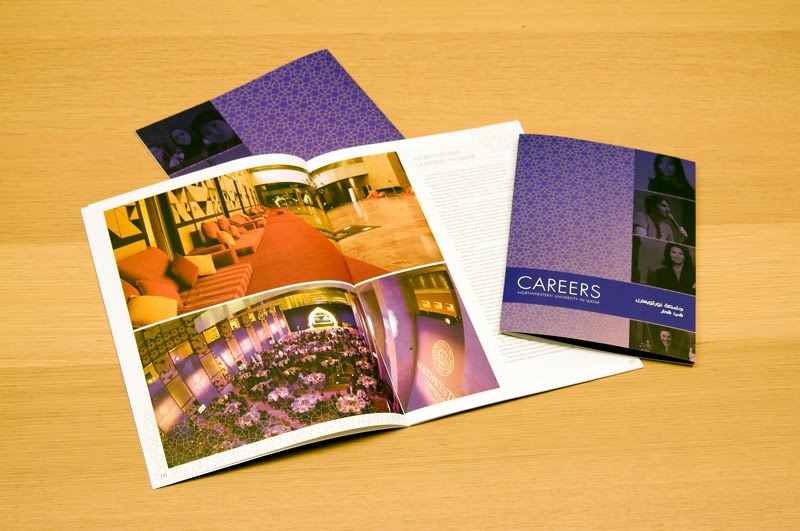
New work from MORRIS for NUQatar

Recently, we had the pleasure of working on an Admissions Brochure and Career Book for our clients in Qatar—Northwestern University. We established the look and feel during our first go around with the Admissions Brochure. A couple months later, they hired us to layout the same design in Arabic! This was my first experience working with an Arabic printed piece. The Arabic language is read left to right so we worked with a great translation company here in San Diego, Local Concept. Their team reversed the layout and made edits while we finessed the details. And the pièce de résistance—binding on the right. Here are some pics of the pieces, printed 4/4 + 2PMS (gold and purple) + satin AQ on McCoy silk, 100#C and 100#T. Printed at Rush Press.


Design Humor...


Design humor... compliments of fellow blogger... http://printingrocks.tumblr.com/

Tuesday, April 20, 2010

Quality is job one!

I spent a little time blogging about the topic of quality assurance (aka QA or QC—quality control) previously in my post: QA—A Little Help for Everyone. In it, I discuss the value of QA and provide my readers with a link to proofreaders marks, an important tool for editing documents. And, since it’s an apropos follow up to my last post, I thought I’d delve a little deeper this time around.

Diving deeper was a direct result of a situation that arose with some mistakes on a magazine we designed. After it was printed, our client informed us that there were at least two misspellings that were our fault. This forced us to find ways to incorporate checks and balances into our QA process. We moved forward with a solution for ensuring that items such as these were not missed in the future.

In addition to requesting lists of names, photo credits, photo captions, etc.—which we were already doing—we created a QA checklist. Since then, it’s been an imperative tool for proofing, for both our clients and us.

It seems like a no-brainer, but you’d be surprised how many details go into a document. A simple mistake can cost thousands. The rules differ for each job we produce, so, we created a template that can be customized to fit any project.

Here are some of the basic categories (we ask our clients to ensure the following items appear correctly on the piece):

______ Mandatory elements are included (per client request)
______ Proper nouns - such as companies, names, titles, locations, cities, etc.
______ Contact information
_____ emails _____ addresses _____ phone numbers _____ fax numbers
_____ URL’s _____ websites
______ Facts and figures (Annual Reports, specifications, etc.)
______ Dates
______ Photo captions
______ Photo credits
______ Make sure photos match corresponding headlines and captions
______ Define grammatical style and rules
______ Define special rules (rules specific to the document)
______ Table of contents (especially if pagination has changed a lot or last minute)
______ Pagination
______ Fonts

Then, if applicable :
______ Product imagery
______ Legal marks
______ Design rules (if style guide is supplied)
______ Other : Please describe here [special rules that were established during design (i.e. paragraph capitalization and indentation, etc.) or special rules established by the client].


We note all applicable rules on our QA checklist, and we send this to our client prior to final proofing. In the first version, we typically send the following statement:

Upon review of the items listed above, please submit any additional edits to the designer or project manager.

The final QA checklist (signed, dated, and faxed back to us prior to going to print) states the following:

Once edits are completed and approved, please sign below.

I have carefully reviewed and approve all artwork, design and verbiage on this project. By signing below, I release MORRIS from liability due to photographic or typographic errors. I authorize MORRIS to begin print production.


This list can also be further expanded on for web jobs.

At MORRIS, quality is non-negotiable. Having an effective system of checks and balances in place helps ensure that our clients receive what is expected.

Thursday, April 8, 2010

Estimate Guesstimate, Get it Right!

It never ceases to amaze me how much there is to learn in the field of print production. Papers are constantly being updated, technology is regularly improved upon, we have to keep abreast of USPS standards, and each job presents it’s own unique challenges.

The quantity and page count typically determines whether it will be printed digitally, offset, or on a web press. The budget determines the quality of paper, number of inks, and finishing techniques. The end use determines whether or not the piece will be mailed, and—if it’s mailed—whether or not it will be wafer sealed and ink jetted or collated into envelopes and labeled and the list goes on and on.

While each project is unique in it’s own right, there are a few basic guidelines to follow in the preliminary stages of estimating print projects. Below is a list of important information to obtain at the start of a project.

Obtain as much information as you possibly can from your client.

Start with general questions such as:

• Who is the end user (are they trying to impress someone with the piece, is it going to a sales force, is it going to a high-end consumer)?

• What are their expectations re: the final product (are they expecting a piece with bells and whistles or something bare bones)?

• What kind of budget do they have for print production? 


Then, break it down into the nitty-gritty. For every project, I create a Request for Quote (or RFQ for short), which outlines the specifications of the project. The answers to the questions listed below will be your guide for determining design direction and the price of the printed portion of your clients project.

The RFQ includes the following elements:

1) Date
From the beginning to the end of a project, specifications typically change. It is common to request several estimates or updated estimates from your vendor. Keeping track of the date on your RFQ’s will ensure you and your vendor have the most up-to-date specifications.

2) Sent by, phone number and extension (if applicable)
In the event your sales rep is unavailable and someone else needs to contact you, provide your name and contact information.

3) Project Number and Name
At MORRIS, we have naming conventions for all of our projects that include a three-letter client code (i.e. Chargers = CHA), a job number, and the year. We number them as the jobs are approved and enter them into a time-tracking system called FunctionFox.

4) Quantity
How many pieces does your client want printed? Ask for a quantity or—if they’re not sure—request a quantity range—i.e. 5,000, 10,000 and 15,000 quantity. Not only will you need this information to obtain an estimate, the quantity of printed pieces (along with the size and pages of the piece) will also determine how the project should be printed. Price breaks on digital jobs usually take place around the 1,000-quantity mark. Sheet-fed, offset presses typically provide the most value and quality for quantities between 1,000-100,000. When you get into the 100,000+-quantity range, you can start looking at web presses as a more economical option.

5) Size
A very important element of the project and the estimate—size plays a huge factor in determining cost and type of printing necessary. Most digital presses are limited to printing items 12” (h) x 18” (w) and smaller. Knowing quantity and size ahead of time can prepare you and help guide your design. For example, a landscape brochure cannot be printed on most digital presses.

When specifying size, it is important to note (h) = height and (w) = width. I also typically, note the finished size and the flat size. For example: If the finished size is = 8.5” (w) x 11” (h), the flat size (the size of the piece when it is open/laid out flat) = 17” (w) x 11” (h).

For pieces with folds, note the flat size and specify what type of fold you are using. You can look these up online or, click here for a great production resource.

For complicated projects, it is a good practice to provide an illustration, photo, or mock-up example of what you want to accomplish and speak with your sales rep to clarify your specifications.

6) Pages
How many pages is your printed item? Pages are calculated back-to-back so, 1 sheet of paper = 2 pages. If you are using different weight papers for the cover and the interior of your piece, you would note this as follows: (i.e.) 20 pages + 4 page cover. Otherwise, if you plan to use the same paper throughout the piece, just note the page count (24 pages). As a general rule, brochures, books, etc. should be designed in even page increments. Binding selection has a major effect on design and pagination (see binding and finishing below).

7) Paper
Paper selection is usually based on a variety of factors. For more information on how to select an appropriate paper, see my previous post: Bridget in Paperland.

8) Ink
Check with your print vendor to find out what types of presses and how many ink/varnish towers they have. Dependent on your specs, your printer can make recommendations. Ask them if their presses have any limitations such as capacity to print various weight papers. I discuss an example of this in my post on Murphy’s Law.

For digital printing, you are limited to CMYK printing only and, dependent on the press, you may be limited in your paper selection. Plus, most digital presses do not have the ability to apply varnishes or aqueous coatings.

For an offset job, your options expand tremendously. Please note: the more inks, finishes, and specialized coatings you use, the more it will cost your client. In the case of inks and finishes, it’s a good practice to look at options.

Most printed pieces are built using CMYK as their baseline. The C, M, Y, and K in CMYK represent different colors (cyan, magenta, yellow and black). They are noted as 4CP (4 color process) on an RFQ. Pages printed back to back using this process are noted as follows on an RFQ: 4/4CP.

If you have a client that has a PMS color that is associated with their brand and it is used throughout the document, you can also call out PMS colors on your RFQ [i.e. 4/4CP + 1PMS (i.e. PMS 354C)]. For every color you add, you are adding additional cost. The value of this cost depends on what is important to your client.

For more info on the differences between CMYK and PMS colors, see: CMYK vs. PMS colors.

For pieces printed on coated paper, it is common to use aqueous or varnish. Specify your coating in the ink section of your RFQ, noting that you are covering the piece throughout (if applicable), or specify exactly where you want to coat. There are a lot of interesting options when it comes to finishes. My favorite technique is the strikethrough method. My favorite coating is called soft-touch aqueous.

Ask your vendor for printed samples that are similar to what you’re specifying and request suggestions on different coating options and effects.

9) Binding
Keep in mind the overall feel of the piece when choosing binding. The number of pages in the piece also typically influences binding selection.

The most economical method of binding is called saddle stitching (binding the item with staples on the spine). It is a great option for items with small page counts. An imperative consideration when designing a saddle-stitched document is to note, your pagination must be divisible by four.

A more sophisticated binding method is called perfect binding. Same as a book, a perfect bound document has a spine. The pages are glued into the piece rather than stapled. For this reason, a perfect bound book must have a minimum number of pages (check with your vendor, this number will be based on the weight of the paper you have selected) and it is not necessary to design in 4-page increments.

There are a variety of less traditional binding methods available as well, many of which add a lot of character to the printed piece. For more binding options, check online or ask your vendor. Regardless of which binding method you choose, always take binding into consideration when designing your document and leave room in the gutter to make up for the paper that will be utilized to bind.

10) Finishing
How does your client want their printed product delivered? Common finishing requests would include trimming, shrink-wrapping, collating multiple items, stuffing into envelopes, wafer sealing, ink-jet labeling, prepping for mailing, etc. Finishing always depends on the end use of the product and where and how the product will be stored or distributed. You can request that your vendor list finishing as line items if there are various options for the project (for example, stuffing envelopes and adhering labels vs. wafer sealing and ink-jetting).

11) Proofs
Do not go to press without looking at a full-set of color proofs!! This is where the process of quality assurance REALLY kicks in. SCOUR those proofs for edits and look at them for color correctness. Check photos for resolution and note where color adjustments need to be made. Your print vendor’s in-house design production team should be able to make any necessary corrections, however, this increases the overall cost to your client. As an option, if you are capable of making changes to the links yourself, you can provide new link files to your vendor (keep the same naming conventions on updated files).

Your vendor will lay out your files in print-ready positioning on the proofs so, at this stage in the game, if there are copy edits, typically those are performed by your vendor. Ask your vendor for their hourly rate to make edits, and include it as a line item in the estimate you create for your client. Give them a range (i.e. minor copy edits 1-2 hours @ $XXX/hour) and explain that they will incur additional costs if edits to the files are requested after delivery to the vendor.

Proofing Tip
For documents that are photo heavy, include the cost to do a set of “loose” or “random” proofs in your initial estimate. This process requires a bit of legwork and coordination on your end, but if you are responsible for photo retouching, it saves a lot of time and money in the end. Essentially, once photos are approved, provide them to your vendor. They will create a set of proofs that include the images only. This gives you the opportunity to check them and make adjustments as necessary BEFORE delivering your final files for press (thanks to John Rubey at SquarePeg Packaging for that tip!)!

12) Special Instructions
If the items need to be shipped to several locations, if there is more than one piece that needs to be collated, if I have an attachment or example, I note that here. Include information about kiss or die-cutting or any additional special instructions for your piece here. Essentially this section should include all info above and beyond the original RFQ categories.

13) Samples
Make sure to request samples of your printed design fabulousness from your vendor ahead of time! A good number (depending on the price per piece and complexity of the project) is in the 20ish range.

14) Shipping and Delivery
Often overlooked, this is a huge element of every printed project.

Many times, our clients request that we include shipping guesstimates within their initial print estimate. Provide your client with options (Priority overnight, standard, economy, ground, etc.) with timelines. Priority/overnight and international shipping costs can be outrageous sometimes, particularly since printed items tend to weigh quite a bit.

Put the costs and turnaround times on the table from the start. It is important to include that timing in your production schedule since your printing timeline is typically guided by a deadline. Include shipping samples to yourselves in this cost.

If necessary, you can split your shipment into partial quantity (rushed) and the remainder can arrive at a slower pace. This is a great way to save time and money on the tail end of a production schedule.

Ask your client:

1) HOW would they like it shipped? Having costs and timelines handy will help them decide which shipping method will work best for their budget and delivery date.

2) WHERE is the item being shipped? Ask them for a zip code or mailing address! Your vendor will need that info to estimate shipping cost.

Does your client use a mailing house? Do they have a distribution list? Do they want samples shipped directly to their business? Are they shipping to a trade show? Are they shipping to a residential location? Are there any special delivery considerations (i.e. gated communities with codes, will someone be there to receive the package, what time of day is convenient)?

3) WHO are they shipping it to? Are they shipping it to a specific individual? Are they shipping to multiple people? Ask your client to provide the names of those individuals.

4) HOW MANY are they shipping? How many pieces are going to each delivery address? How many samples would they like? How many samples would you like?

5) WHEN do they need to be delivered by?

When sending your first estimate, it’s a good practice to let your clients know that your initial cost presentation serves as a ballpark number. Provide your client with an updated estimate as you near the end of the project, once specifications have been finalized. Open communications regarding changes in costs are an imperative part of any client/designer (or agency) relationship. Believe me, it will save you from difficult conversations down the line.

More to come… best practices for quality assurance and follow up once the job is printed!