For the full video, outtakes and behind the scenes footage: http://www.thinkmorris.com/recipeforlove/
Wednesday, December 23, 2009
Happy Holidays—Bringing Back a Classic
Bringing back a classic .... Gingi!!! in Recipe for Love... from your friends at MORRIS!
 For the full video, outtakes and behind the scenes footage: http://www.thinkmorris.com/recipeforlove/
For the full video, outtakes and behind the scenes footage: http://www.thinkmorris.com/recipeforlove/
Tuesday, December 22, 2009
Happy Holidays From the Crazy Crew at MORRIS
 One Nutty Family—MORRIS.
For our holiday card this year we decided to take pics of our team in the classic, but not so flattering "Olan Mills" style with some character twists—figuratively and literally. We find this annual holiday card a great opportunity to share the personality of our team. If it's not obvious, we're... having lots of fun too. And while we take our work seriously, we don't take ourselves seriously. The photos here are all taken by our staff photographer "Flash" and carefully chosen for your viewing pleasure.
Best wishes from all of us here at MORRIS for a happy holiday and a healthy, peaceful and prosperous new year!
Friday, December 18, 2009
Package Design and Flexography—Printing Limitations
To my knowledge—at least since I've been the Print Production Manager at MORRIS—we haven't used flexo printing.
Recently we were asked to design a ticket that would be printed using this method. The difference between offset printing and flexography is that the image is transferred directly from the plate to the substrate (no blanket), in this case paper. It's used most often for packaging. A flexo press can print on a variety of materials, including plastics, labels, cardboard, etc.
Here are some tips and limitations to consider when designing packaging. This info came from packageprinting.com.
Although many of the recent improvements in flexo printing have broadened its capabilities, specific factors need to be understood when designing graphics for this process. According to Terri McConnell, director of brand strategy for Gravity, a subsidiary of Phototype, flexo has a several important limitations that must be considered. These include:
• Dot gain is a problem, especially when creating drop shadows and soft gradients, blends, and vignettes;
• Minimum line weights and type sizes are more difficult and traps are often heavier, making small type areas and more elegant, fine-line aesthetics challenging;
• Registration limitations dictate the use of outlines around reverse copy and graphics on backgrounds made from more than one color;
• Having to run separate plates for tone/screen and solids of the same color can significantly impact the number of ink stations available for design, notes McConnell.
“There’s no question that designing for flexo requires special consideration and forethought,” observes Rick Murphy, creative director for Gravity. “Just as an artist has to understand the unique characteristics of watercolors versus oils, package designers must understand the differences between the flexo and offset or gravure mediums in order to conceptualize a winning package that won’t disappoint when it comes off the press onto the shelf.”
Tuesday, December 8, 2009
Press Jargon 101—So exciting.
After reviewing my goals, I realize I've been really slacking on my responsibility here! It's probably best I post something that you can learn from—I know it's been awhile!
This particular installment is for folks JUST getting into print production. A little lesson on print jargon, most of it straight from the folks at Mohawk, Wikipedia, and About.com.
In 2007, Mohawk put out a little flip book called Vital Information. I have used that item as a resource since (especially when I'm proofing and the age-old em and en dashes vs. hyphens issue comes up!). As I perused the book, I ran across some press lingo that's widely used. Knowing the vernacular will give beginners a leg-up when dealing with print vendors.
Plate: Printing processes such as offset lithography (see definition below) use printing plates to transfer an image to paper or other substrates. The plates may be made of metal, plastic, rubber, paper, or other materials. The image is put on the printing plates using photomechanical, photochemical, or laser engraving processes. See image below for an example of a typical plate, printed on metal (or aluminum).

Offset: Short for "offset lithography." A commonly used printing technique where the inked image is transferred (offset) from a plate to a rubber "blanket" (essentially, a rubber plate) to the printing surface (paper, etc.). It is the most common form of printing used for quantities between 1,000 and 100,000. See image below.

Sheet-fed: Method of printing on sheets of paper. See image below.

Parent Sized Sheet: Most mills offer their paper in "parent-sized" sheets. A typical parent sized sheet is approximately 35" x 23" or 35" x 40." These are the sheets the offset presses typically use. Your print vendor's pre-press team will figure out how to layout your design on the parent sheets of the paper you specify.
Gripper Edge: The leading edge of the paper as it passes through a printing press.
Sheetwise: To print one side of paper with one set of plates, then turn the sheet over and print the other side with another set of plates, using the same gripper and side guide.
Web: A method of printing on rolls of paper (vs. parent sized sheets). This method is typically used on items that require you to print large quantities (100K+). See image below for an example of a web press.

Hope this basic lesson in press jargon was helpful. Now, print with confidence!
b
This particular installment is for folks JUST getting into print production. A little lesson on print jargon, most of it straight from the folks at Mohawk, Wikipedia, and About.com.
In 2007, Mohawk put out a little flip book called Vital Information. I have used that item as a resource since (especially when I'm proofing and the age-old em and en dashes vs. hyphens issue comes up!). As I perused the book, I ran across some press lingo that's widely used. Knowing the vernacular will give beginners a leg-up when dealing with print vendors.
Plate: Printing processes such as offset lithography (see definition below) use printing plates to transfer an image to paper or other substrates. The plates may be made of metal, plastic, rubber, paper, or other materials. The image is put on the printing plates using photomechanical, photochemical, or laser engraving processes. See image below for an example of a typical plate, printed on metal (or aluminum).

Typically, printing plates are attached to a cylinder in the press. Ink is applied to the plate's image area and transferred directly to the paper or to an intermediary cylinder and then to the paper. The printing plates used depends on the type of press, the printing method, and quantity of the print run. A plate is prepared for each color used, or four plates in the case of 4-color (CMYK) process printing.

Sheet-fed: Method of printing on sheets of paper. See image below.

Parent Sized Sheet: Most mills offer their paper in "parent-sized" sheets. A typical parent sized sheet is approximately 35" x 23" or 35" x 40." These are the sheets the offset presses typically use. Your print vendor's pre-press team will figure out how to layout your design on the parent sheets of the paper you specify.
Gripper Edge: The leading edge of the paper as it passes through a printing press.
Sheetwise: To print one side of paper with one set of plates, then turn the sheet over and print the other side with another set of plates, using the same gripper and side guide.
Web: A method of printing on rolls of paper (vs. parent sized sheets). This method is typically used on items that require you to print large quantities (100K+). See image below for an example of a web press.

Hope this basic lesson in press jargon was helpful. Now, print with confidence!
b
Friday, November 20, 2009
Urban Trees 6 - WOW.
Nothing production related today... just a little inspiration, from some talented artists in my area.
The Port of San Diego just recently updated the 6th installation of Urban Trees. The sculptures are updated annually. My son and I have spent a lot of time with the sculptures–their whimsical names and shapes have sparked our imagination, and I am excited to share them with you.
This video showcases the making of one of the sculptures titled "Elysium," by artists Gretchen Mars & Brian Salmon.
"This sculpture’s design stems from Bonsai trees and lotus flowers and represents the contrasting coexistence of organic versus man-made materials. The twisted metal roots beautifully sprout into laser-cut wood leaves. The process and materials used to create the tree play upon the idea of the evolution between man and technology. "Elysium" is a place or state of perfect happiness."
Enjoy.
Here are some pics my son and I took of the last batch, as well as a few from the Harbor/downtown in general (my own urban inspiration):
http://www.facebook.com/album.php?aid=9379&id=1295581594&l=e675251397


For more on the newest sculptures, go here.
http://www.portofsandiego.org/public-art/urban-trees-6/1710-urban-trees-6-gallery.html
Tuesday, November 3, 2009
No More Crusty Edges—The Solution
Well, for Clients who have "sky's the limit" budgets, here's a GREAT solution to the problem I refer to in my "To Blue or Not to Blue" post. Thanks to @Circa71 (http://twitter.com/circa71)—one of my Print Production Manager twitter buddies from http://www.realartusa.com/ in Ohio—for the suggestion! These guys : http://www.beastpieces.com/2009/04/electric-green-edges/ and http://www.rohnerletterpress.com have the capabilities to do this.
Pretty cool, eh?
You can follow me on twitter here: http://twitter.com/FabrcationMastr

Pretty cool, eh?
You can follow me on twitter here: http://twitter.com/FabrcationMastr

Friday, October 30, 2009
Top Ten Websites - Oh Yeah.

MORRIS was honored by HOW as one of the top ten design websites.
Check out the link... and our website!
http://www.howdesign.com/top10sitesfordesigners/
http://www.thinkmorris.com/
Thursday, October 22, 2009
To Blue or Not to Blue? That is the Question!
Through adversity we become stronger… is that how it goes? I’m thinking perhaps that should be changed to “we become crazier,” because sometimes, I am completely blown away by Murphy’s Law. Just when you’ve moved over the threshold—BAM!—next!
At least it’s fodder for my blog. Here’s the story of our latest challenge.
We’re working on a business card for a relatively new client. It’s just a business card, right? Should be easy enough.
He’s looking for a very professional presentation, knowing that the business card is the first impression of his new brand (that we recently renamed and created a logo for). The typography on the card and his logo are white and yellow and the symbol has a little gradient in it that radiates out from the center.
Our designer came up with a great solution that looks beautiful, but producing this card, that’s another story, and as you’ll see, it’s complicated.
It’s not often that we are able to recommend printing on a specialty paper but for this project, it was certainly appropriate. Our paper selection was an uncoated linen 100# cover stock in navy blue. It’s a great sheet of paper, the perfect thickness, very high-end—blue on both sides.
I sent the request for an estimate to three separate vendors. Two of the three vendors replied with alternative solutions because printing white and yellow ink on blue paper, is a difficult—if not impossible—task that usually results in a negative outcome.
The first vendor recommended we go with a white paper, print blue and yellow on white, knocking out (aka reversing) the white type while printing. The second vendor recommended foil.
I went back to our designer with the first vendor’s recommendation. Nope. The original goal was to produce a card that would not get “white crusty edges.” The concern was that, once trimmed, the card would lose its verve, so to speak, and look less professional.
Alright, back to the drawing board. Vendor #3 offered to do some draw-downs of the yellow and white ink on the blue paper (samples of how the ink looks on the paper) so we could see what they looked like. When we got them back, we realized the Vendor #1 had a valid point. The yellow, ew!, it looked green! And the white didn’t really stand out.
Back to the drawing board. I got on the phone with Vendor #1. There were a couple additional concerns.
Another paper we specified was a linen blue and white duplex sheet—two 65# cover sheets essentially heat-glued together—with a 130# cover weight.
This brought up CONCERN #1) The limits of the press. For smaller runs with fewer colors, our print vendors typically use their smaller presses. It’s less expensive and opens space on their larger presses for bigger jobs. The issue with this is that many of those smaller presses can only handle papers up to 100# cover weight. Thus, the duplex sheet wouldn’t work on the more economical machine.
The benefit of the blue and white sheet was that if we chose to use it, we could easily print the inks on the white side and we could consider options for the blue side. Playing on the recommendation of Vendor #2, it was time to discuss foil.
Foil was a good option but, since the papers we chose were uncoated and **maybe** not thick enough, and because foiling requires you to essentially heat-set and press the design into the paper, this brought up CONCERN #2) USING FOIL ON AN UNCOATED SHEET WITH GRAPHIC ELEMENTS ON BOTH SIDES. It was likely that wherever the info was foiled, it would show through as a depression on the other side. Seriously? And, if we had chosen a coated stock, we’d have better luck because the coated stock is more compressed than an uncoated sheet and it would take the impression better. But the uncoated sheet speaks this brand! Alright, mental note, good to know.
Then, CONCERN #3) PRINTING A LIGHT GRADIENT ON A DARK SHEET OF PAPER. There is pretty much no way to print a white and yellow gradient on a blue piece of paper, unless you foil underneath it and then we’re back to problem #2.
I just want to see with my own eyes, what happens to this paper! Can I get a foil draw-down please? Oy. OK. The see-through is pretty apparent. Back to the drawing board.
What other options do we have if we want to avoid the tattered edges?
I looked into gilding the edges (coating the edges with gold/silver), even taking a sharpie to them (not really) but alas, ultimately, this project could not be completed as specified—at least not successfully, and we didn’t want to take that risk.
So, we’re back to the original recommendation—printing these on white paper, with reversed out type, 2-color job (blue and yellow). Looks like flaking edges are unavoidable but it’s a small price to pay for the peace of mind that the printed graphics will look great.
Note to self: Do not specify light colored inks on dark colored papers, especially if you have a two-sided design, it’s impossible to pull off from a production standpoint.
Wednesday, September 23, 2009
Sweet Projects and Effects—Our most recent accomplishments!
I have been absolutely SWAMPED! It would be ridiculous to complain in these economic times but I must apologize because my blog has definitely taken a hit! Thanks for hanging in there with me!!
I truly feel honored to collaborate with our clients and design team on such amazing projects. Most recently, we turned out:
- An AMAZING flip book for the updated line of Sony Cyber-shot cameras
- Various trade show items and a folder with a strand of spot gloss varnish DNA for Pathway Genomics
- Updates to two 2010 versions of Medill @ Northwestern Graduate and Integrated Marketing Communication View Books (and spent a day and a half at the printer press checking them).
- Finessed new specs and a new relationship with a vendor in Chicago to produce Medill’s alumni magazine.
- And, we worked on a super-secret project for a high-profile client, which I cannot divulge just yet!
It is always so rewarding when these projects come to fruition and our samples arrive. I am so amazed by printing technology and everything our vendors can accomplish in such a short period of time. Here’s a shout out to our vendors—Rush Press, EarthColor, Skyline San Diego, and Schneider Graphics, for doing such a tremendous job on all of these projects!
Take a gander:


One of the printing methods we often use is called strikethrough. You can see on both the Sony flip book and the Pathway folder, how the method is used to create a result. You can use either gloss UV’s or gloss varnishes to create these effects. The gloss varnish is more economical and is typically the quicker route but the gloss UV really makes the images or typography pop off the page, especially when you are using dull UV varnishes in conjunction.
Essentially, your printer will lay down the ink and then, a full layer of gloss. The key to making the gloss “pop” is the juxtaposition of the shiny gloss and the dull varnish working side by side. Your vendor will create a separate plate for the dull varnish, which, based on the way the file is designed, omits certain areas. Our designers create clipping paths (or masks) of the items they want to highlight and save them on a separate layer (or separate file) indicating the gloss UV/varnish area. The areas highlighted in white (or, often times, in magenta) are the areas that will pop when printed. For the Sony flip book, in addition to hitting the product shots, we highlighted this technique by setting up a “blind” varnish (i.e. a varnish effect with no actual printed imagery or typography below it). This method is most effective on dark backgrounds, however, as seen in the Pathway folder example, it can also be used subtly, to create interest.
Here’s an example of how the file is set up:
The first image is the final, print-ready file. The second image is the varnish file.


And... here's the final outcome:

Pretty groovy, eh?
Check with your print vendor regarding their methodology. Each facility has a unique procedure for attaining this result. For example, the same outcome can be achieved by printing a full layer of dull varnish first, then imprinting a spot gloss varnish on top (as in the Pathway folder example). In this case, if you are working with photographic images or large areas of solid color, please keep in mind that the dull varnish tends to tone down their overall impact, so make sure you understand your printer’s process, when choosing to incorporate this effect.
Utilizing specialized printing techniques can really give your projects and your Client’s products/brand the POP! they need to make them stand out. This technique is one of many. MORRIS—making cameras and DNA sexy. ;~)
Wednesday, August 26, 2009
Is Social Media Just a Fad?
Great video! Well designed and effectively communicates the pros of social media.
Tuesday, August 11, 2009
Is it a HORROR FLICK with a TWIST of ROMANCE??? Nope, it's just design & printing terminology.
• BLEED • DIE • SCORE • KISS CUT • SPREAD • TRIM • TIP IN • LIVE AREA •
Visions of a slasher movie with a romantic twist come to mind... but alas, it's just design and printing terminology.
In every industry, there exists terminology specific to that business. In design and production, there’s no exception. I thought it would be helpful to share some of the basic definitions here, for designers who are just getting started. Not a terribly exciting topic but relevant nonetheless. Bookmark this page for reference, and refer to it as these familiar terms cross your plate in the future.
SPECS—LIVE AREA—BLEED—TRIM
Typically, creative directors, publishers, and sometimes printers (depending on the project), provide designers with specifications for their projects. These SPECS (for short) typically include what are referred to as the LIVE AREA and the BLEED. The LIVE AREA refers to the space the design must be contained in. The BLEED is the intentional continuance of the design beyond the live area (usually about .125” on all sides). Bleed is an important element of designs that go all the way to the edge of the paper. It is incorporated because the printer TRIMS (aka cuts) the design to the desired size (live area) once the item is reproduced, removing the extra .125" of bleed for a clean and gorgeous end product.
SPREAD
A SPREAD consists of two pages that face each other and are designed as one visual or production unit.
The following items refer primarily to finishing techniques or items you might specify when estimating a print job.
4 COLOR PROCESS or PROCESS COLORS vs. PANTONE or SPOT COLORS
See my blog entry from May 18, 2009 for the differences between specifying 4CP/CMYK vs. Spot Color/PMS. http://concoctionconspirator.blogspot.com/2009/05/cmyk-vs-pms.html
AQUEOUS vs. VARNISH COATINGS
I couldn’t have said it better myself. For more information on these items, please refer to this link, with an article on the pros and cons/differences. http://www.printindustry.com/newsletter_18.htm
SCORE/SCORING
Scoring simply refers to paper or card stock that has been compressed along a straight line (either by a machine or by hand) so it folds easily and accurately.
DIE/DIE CUTTING
Think of custom packaging, jigsaw puzzles, and stickers—anything with a customized shape. A DIE cuts, scores, stamps, embosses and debosses printed items. DIE CUTTING occurs when the die is utilized to cut or impress irregular shapes in paper, stickers, labels, or paperboard.
KISS CUTTING
KISS CUTTING is when you die cut through a peel n' stick sheet, applying just enough pressure so the die slices through the adhesive, but not through the back of the sheet. This enables the user to pull stickers off one at a time from the larger intact sheet.
TIP IN
A TIP IN is an extra page or design feature that is added to a printed piece beyond the normal process. It can be applied as a novel design adaptation and may be created using the same or different paper than the original printed design. In one of the pieces we’re currently working on, we are tipping in actual photographs to show the range of a particular product.
SADDLE STITCH
SADDLE STITCHING is a binding technique for multi-page printed pieces. Essentially, it means that the item is bound using staples (typically 3). For smaller creations, this is a cost-effective means of binding. Designs must be created in 4-page increments (8, 12, 16, 20, 24, etc…) up to a certain maximum size—dependent upon your paper choice.
PERFECT BOUND
PERFECT BINDING is also a binding technique for multi-page printed pieces. When requesting perfect binding, please note that your design must be a minimum number of pages (approximately 24+, depending on the weight of the paper). One of the benefits of perfect binding is that you do not have to create your document in 4-page increments. The pages are glued on the edge and can accommodate odd numbered pieces. Books are typically perfect bound.
For today, I’ll stop here. The world of print production is filled with nomenclature that, I admit, can become overwhelming at times. This basic list will have you sounding like a pro in no time flat. ;~)
Tuesday, August 4, 2009
Color Inspired Typography
One of my co-workers sent me the link to this amazing website where you can search typography by color. It's pretty cool—anyone can upload a photo if you have an online link to it. The site reminded him of our Urban Inspiration project. I was inspired to submit my "PLEASE LET DOWN EASY" shot. Here are some screen grabs to inspire you too!

http://welovetypography.com


http://welovetypography.com


Friday, July 24, 2009
URBAN INSPIRATION GRIDS
Here are a few of the images that were created by our multi-talented employees!


Tuesday, July 21, 2009
MORRIS Rebrand Launch—Yay! Check it out.
It's official! Today we launch our new brand!
I can finally post those pictures of the stationery I promised to post back in April. See Murphy's Law—Part 1 and 2 for the process it took to get here.
Check out our sleek new website: http://www.thinkmorris.com/
and the stationery system and CD/DVD's to match :).


Thursday, July 16, 2009
Urban Inspiration 1—COLOR
Today, I coordinated a little field trip out of the office.
A couple months ago, my boss presented us with this year’s BHAG—aka Big Hairy Audacious Goal (a BHAG encourages companies to define visionary goals that are more strategic. The concept was originally proposed by James Collins and Jerry Porras in their 1996 article titled, Building Your Company's Vision).
Our BHAG contained one goal in particular that really sparked my curiosity, “Cultivate a mindset of innovation…”
While I don’t officially consider myself an inventor, I do consider myself an idea person—particularly lately—since I have entered (and done well with) a few of my submissions on the www.edisonnation.com website. It’s impossible to sum up the EN website and the company behind it (Eventys) without going into a long explanation. Suffice to say, it’s revolutionary and it is providing opportunity to a lot of everyday folks.
At the same time the BHAG was introduced, we unfolded a new “goals” process. We were asked to relate our professional goals to the BHAG in general—to work towards our ultimate goal of truly living the document.
I thought back to that goal, “Cultivate a mindset of innovation…”
To work on my own creative mindset, I had already bought “Thinkertoys—A Handbook of Creative-Thinking Techniques” by Michael Michalko. It teaches you how to train yourself to be a creative thinker.
One of the suggested exercises from Michalko’s book asks the reader to direct their attention to one color and spend all day seeking that color. The idea behind this focusing exercise is to help people see the world around them in a new light. By focusing on the details, they have a greater experience with that color, and it forces them to pay attention.
Since design is seriously influenced by color, I thought this would be a fun way to begin the implementation of one of my professional goals—coordinating learning opportunities for our employees to help them develop a more innovative mindset. I called the workshop Urban Inspiration (1).
I gave the exercise a little twist, and asked everyone to bring in their digital cameras and walking shoes. We split up into groups of two—I think everyone had a camera—and then we chose colors (red, green, yellow, blue, brown, and silver/chrome). I gave everyone a list of things to shoot—a person, typography, a logo, 5 close-ups, a photo of something in the distance, something natural, something stereotypically urban—and hoped they would just shoot pictures of anything that color.
It will be exciting to see everyone's completed photo grids. I couldn't wait so I posted mine below.
Here’s a little inspiration from Michalko:
“Creators are joyful and positive. Creators look at ‘what is’ and ‘what can be’ instead of ‘what is not.’ Instead of excluding possibilities, creators include all possibilities, both real and imagined. They choose to interpret their own world and do not rely upon the interpretations of others. And most importantly, creators are creative because they BELIEVE they are creative… No matter how indifferent the universe may be to our choices and decisions, these choices and decisions are ours to make. We decide. We choose. In the end, our own creativity is decided by what we choose to do or what we refuse to do. And as we decide and choose, so are our destinies formed.”

Wednesday, July 15, 2009
QA—A Little Help for Everyone
Such a big part of my job at MORRIS is quality assurance. You would be surprised how many hours go into the painstaking process of proofing a document. Recently, I spent 7 hours (!) proofing a training guide for one of our clients—and that was just round 1. Yesterday, we received the printer proofs, which I spent another 5.5 hours on. Today, we're expecting another round, with the edits implemented, which I will likely spend an additional 2 or so hours on.

At MORRIS, we realize that our name is associated with every project that goes out our door. We are extremely proud of the work we do, primarily because our clients can rest assured that we will turn around a QUALITY project for them. Quality is one of those things that's non-negotiable—each of our employees take pride in that fact.
Before I took on the role as the Production Manager, I didn't have a clue about proofreaders marks. This was another design detail my teachers failed to mention while I was in design school. I think about those poor pre-press folks, who receive proofs with copy edits marked up by several different people without access to this information. Oy.
Where process is concerned, there can be overkill, but in this case, it has proven to be an asset to have everyone on the same page.
I scanned this page from the book I recommended earlier, "Forms Folds Sizes—All the Details Graphic Designers Need to Know but Can Never Find," by Poppy Evans. I give it to all our new employees when they come in the door. It's very helpful for both client projects and edits to internal documents such as proposals, estimates, etc.
Hang on to it for future reference. You never know when it might come in handy!

Wednesday, July 8, 2009
New Tool for Color Geeks!
Of all the paper companies out there, Neenah Paper is, by far, one of the most innovative I have seen. They are on the cutting edge of the market with ecologically friendly offerings and their marketing efforts are stellar. They seem to be a step ahead of the competition when it comes to originality.
One of things I really enjoy about my job is meeting with our paper reps, and seeing the creativity prevalent in their paper swatch books and promo materials.
A couple years back, Neenah came out with an incredibly RESOURCEFUL paper swatch book, based on the Dewey Color System®. The Dewey Color System® was created by Dewey Sadka, who morphed color philosophy into a personality profiling tool. His system bypasses language, and connects directly to the user through their color choices, with a simple, scientifically validated test. Not only was it fun to find out if the personality test was accurate (which it was!), the book was an amazing resource on color and combinations of colors that work well together.
You can try the test online at: http://www.deweycolorsystem.com/
Just recently, our Neenah rep showed me a new mobile application called Think Ink: Color Unleashed for iPhone /iTouch users. How cool! You can pull a color from a photo and the application will give you various palettes to work with, with descriptors. You can choose your palette based on the emotion you want to convey in your design. It’s based on the swatch book above and it can be downloaded free @ http://tinyurl.com/oujv40
Bummer I don’t have an iPhone! Color geeks enjoy!
Monday, June 29, 2009
Branding in the Age of Social Media
This video conference is actually a few months old but it is still relevant today. It contains good info about the differences between previous marketing methods and the relevance of establishing good relationships with consumers today.
Brand = Response vs. stimulus; something that happens in the minds and hearts of the people and the conversations that take place as a direct result of those people's experience with the brand.
Brand = Response vs. stimulus; something that happens in the minds and hearts of the people and the conversations that take place as a direct result of those people's experience with the brand.

Scalable Intimacy
View more documents from Michael Troiano.
Thursday, June 25, 2009
It's the People, Not the Company
I used to work in the HR department for a local organic grocery chain. It was really the first job where I was linked to a retail experience—and my first experience with customer service. From day one, it was my responsibility to teach our new employees the value of connecting with our customers. As a result of providing stellar service that went above and beyond, our company thrived with repeat customers and folks who shouted our praises to their friends.
What a valuable lesson! Thereafter, whenever I came across poor service, I always thought back to my experience there and thought twice about revisiting an establishment that didn't measure up.
In my role as Production Manager at MORRIS, one of my greatest responsibilities—and one of the things I enjoy most about my job— is establishing and maintaining relationships with our vendors. YOU CAN BET that the vendors that go above and beyond for our company—who work with us to solve problems, provide samples, work on budgets, and show a GENUINE interest in us—are the ones who are receiving the calls on a regular basis.
Web sites like Facebook, twitter, myspace, tribe, friendster, and LinkedIn have revolutionized the business world, making connecting with our networks and cohorts easy. A wide variety of resources are suddenly, readily available to us and relationships have taken on completely new meaning.
Everywhere you look these days, people are touting the significance of genuinely connecting with others and the importance of developing authentic relationships as a smart business practice. As someone who agrees, this perspective is a breath of fresh air.
Getting back to what matters, the PEOPLE, matters to me.
Tuesday, June 16, 2009
A Resource I Can't Live Without
My time is limited this week.
I will be at a conference on Thursday—where I am excited to learn more about the state of social media and interactive marketing.
And Friday, I'm taking the day off to go camping sans my little one. Looking forward to some time off (of work and mommy duty) in the great outdoors!
Since I don't have much time to write, I have a book/resource recommendation for everyone who touches design or production in this industry. It's a resource that, quite literally, I couldn't live without.
It contains the following tidbits:
I have found if I need to quickly reference something, it typically has the answer I seek. Check it out!

"Forms Folds Sizes—All the Details Graphic Designers Need to Know but Can Never Find" by Poppy Evans
http://www.amazon.com/Forms-Folds-Sizes-Details-Designers/dp/1592530540/ref=sr_1_2?ie=UTF8&s=books&qid=1245178951&sr=8-2
I will be at a conference on Thursday—where I am excited to learn more about the state of social media and interactive marketing.
And Friday, I'm taking the day off to go camping sans my little one. Looking forward to some time off (of work and mommy duty) in the great outdoors!
Since I don't have much time to write, I have a book/resource recommendation for everyone who touches design or production in this industry. It's a resource that, quite literally, I couldn't live without.
It contains the following tidbits:
- Measurement Conversion Charts
- Copyright and Trademark Standards
- Proofreading and Copywriting Symbols
- Imaging and Color Info
- Typography
- Paper Details
- Bindings and Folds
- Envelopes and Folder Sizes
- Packaging Die Lines
- Info on Postal Standards
- Bar Code Standards
- Printing and Finishing Info
I have found if I need to quickly reference something, it typically has the answer I seek. Check it out!

"Forms Folds Sizes—All the Details Graphic Designers Need to Know but Can Never Find" by Poppy Evans
http://www.amazon.com/Forms-Folds-Sizes-Details-Designers/dp/1592530540/ref=sr_1_2?ie=UTF8&s=books&qid=1245178951&sr=8-2
Monday, June 8, 2009
CONSIDER THIS...
This morning a good friend of mine, who owns a bath and body company, called me for advice regarding an issue with the production of the labels for her products. When she first approached her vendor for an estimate, she provided physical samples of her product (other labels, printed by a different vendor) that were the exact size and material she wanted quoted. Her labels have a rounded corner, which the vendor failed to notice was a different size than the die (shaping tool/machinery) they use. Today, in the midst of proofing her labels, her vendor told her the die size they use for rounded corners (.125”) is the “industry standard“ and if she wants to maintain the size on the rounded corners she submitted, she’ll have to pay an additional $400 to have a new die created. What? Ugh. She already paid a designer to adjust the size of the corners and now, she ‘s stuck in a tough spot. Is it the vendor’s fault for not noticing and not mentioning the difference to her during the estimating process? Is there anything she could have done to prevent this?
CONSIDER THIS… when estimating projects that require die cuts (or rounded corners). An ounce of prevention is worth a pound of cure in these situations. The following suggestions also help to keep the costs down:
Ask your vendor if they handle die cutting and conversion in-house or if they outsource it. If they handle it in-house:
1) Request a full-sized, digital die line file from your vendor.
2) Measure it.
3) Transfer the die line to your design file and use as your guide for design.
4) Print it.
5) Create a mock up.
6) Test it.
If they are outsourcing the die cutting or conversion:
1) Ask them to double check their vendor’s current library of dies and ask them to send you the most recent version of that die line.
2) Then, follow steps 1-6 above.
We ran into a similar issue with our envelopes during the Murphy’s Law project. Our print vendor provided us with the last die he was given by their envelope converter. When we went to print the envelope, the converter had updated their dies. The new file was slightly different than the file we received. Ultimately, we had to adjust the design to fit the new die. A luxury we had but one my friend does not.
Something as simple as the size of a rounded corner, or the angle of an envelope flap, can have a big impact on the final outcome of the image. For every element and every design decision that’s made, pay close attention, ask questions of your vendor, and go into every job filled with as much knowledge as possible. Hopefully, by doing so, you can avoid extra costs and the pitfalls of missed details.
Monday, June 1, 2009
NEW ADDRESS PLACEMENT REQUIREMENTS for flat sized mail pieces
Another detail in the endless realm of design details...
I'm putting out a miniature fire today.
Recently the post office created new address placement requirements for flat sized mail pieces (i.e magazines and mailers). I don't recommend dealing with these issues when your project is about to be plated but... hey, looks like we're in luck today!
So... to spare you the embarrassment and cost (!) make sure to bookmark this blog or check out the new requirements for flat sized mail pieces -
http://www.usps.com/mailpro/2008/mayjune/page8.htm.
as well as information on design requirements in general -
http://pe.usps.com/mpdesign/mpdfr_intro_all.asp
If you have further, in depth questions about designing items to be mailed, search and find your very own Mailpiece Design Analyst here: http://pe.usps.com/mpdesign/mpdfr_mda_lookup.asp (pretty cool).
For those of you in San Diego...
Paula Bigornia - Mailpiece Design Analyst
United States Postal Service
11251 RANCHO CARMEL DR RM 145
SAN DIEGO CA 92199-9602
Phone Number: 858-674-0392
Fax Number: 858-674-0055
Email Address: paula.m.bigornia@usps.com
Happy designing!
Friday, May 22, 2009
Tweet Tweet.
It took a while to convince myself but, what the heck.
You can follow me here now too: https://twitter.com/FabrcationMastr
You can follow me here now too: https://twitter.com/FabrcationMastr
Wednesday, May 20, 2009
Amazing color tool!
I received this recommendation from kimtb as a supplement to my post on color. She has a GREAT design blog on wordpress. http://redesignblog.wordpress.com/ - check it out!
And then... check this out.
http://labs.ideeinc.com/multicolr/#.
I think one could get lost on that Web site for hours!
And then... check this out.
http://labs.ideeinc.com/multicolr/#.
I think one could get lost on that Web site for hours!
Monday, May 18, 2009
CMYK vs. PMS
 CMYK vs PMS. Such fun. ;~)
I was inspired by fellow blogger, Mark Reyland (Just My Opinion), who took on the subject of PMS and CMYK color and how it relates to packaging and product design choices.
He's right, the majority of projects printed on offset presses use the CMYK method of printing.
CMYK is also referred to as 4-color process or process colors. The ink lays down on the paper one color at a time (C = Cyan, M = Magenta, Y = Yellow and K = Black) in miniature dots. The colored dots combine to create an image. This type of printing is typically used whenever photography or illustration is used in graphic design.
 The Pantone Matching System aka PMS is also referred to as spot color. Spot color is used primarily when it is imperative to match (nearly exact) color for a particular brand (i.e. as in the case with pro-sports teams or brands that are renowned for using particular colors). It is a solid color and is used a lot on letterhead, business cards, and jobs where the design doesn't include photography or imagery with a blend of color.
You can save money by using PMS colors if you use less than 4 colors. A nifty trick is that you can use transparencies of a color (i.e. reducing the transparency of a color can provide a wide gamut of tints), and you're literally only using one color on press. As you can see below, one color can yield a variety of "colors." Black transparencies have grey tints, red transparencies tinge pink.

PMS and CMYK printing is not the same.
PMS is broken down into PMS C vs. PMS U (colors appropriate for Coated sheets vs. Uncoated sheets of paper). Selecting the color depends on your paper choice.
And while there is a way to convert color from PMS to CYMK and vice versa, it is difficult to match a PMS color exactly when printing using CMYK. The transition just doesn't translate very well.
Printers can also mix PMS colors to create custom colors. Of course, this is not as cost effective as just choosing one from the PMS book.
One of my absolute favorite books, since I became engaged in this industry, is Leatrice Eiseman's - The Pantone Guide to Communicating with Color. She goes into great depth re: color, symbology, meaning, and emotional connection. She also breaks down PMS color combinations that work well in unison.
Here's some fun with colors and their meanings: (I pulled these off of fellow blogger Dyango Chavez's blog at http://dyangochavez.blogspot.com/2007/03/some-colors-and-meanings.html)
- Red: This is the hottest of the colors. It is energetic, full of life, vibrant and active. It is also one of the most visible colors. It is associated with passion, life, masculinity, energy, danger, anger, blood, fire and power.
- Blue: This is a cold color. Dark blue has been associated with intelligence, stability, trust, depth and intellect. It is also the most calming and relaxing of the colors.
- Green: This is also a cold color. It symbolizes health, nature, freshness, harmony and balance. It has been associated with money, spring and stability.
- Orange: This is a warm color and very stimulating. It is associated with joy, vitality, creativity and energy. It is used to symbolize construction and is a great action trigger. It has been said to increases the craving for food.
- Purple: This color can be cold or warm, depending on the amount of blue or red used in the mix. It is symbol of spirituality, luxury, royalty and power. In some cultures is also associated with disease.
- Yellow: This is a warm color associated with energy, light, happiness, energy, creativity and the sun.
- Black: This can be warm or cold, depending on the colors with which it is combined. It symbolizes elegancy, sophistication and mystery. In some cultures it is also a symbol of death.
The whole world, as we experience it visually, comes to us through the mystic realm of color. - Hans Hofmann -
Enjoy.
Wednesday, May 13, 2009
A Nifty Little Resource
Ooooh, I found a new toy.
For those of you who are verbivores, you have probably noticed the banner ads for the visual thesaurus on the thesaurus.com Web site.
Lucky me, our Head Honcho offers his employees a generous stipend each year, which we can spend on nifty little resources such as this one. Since I wear many hats at MORRIS, one of which includes writing proposals (and a blog!), this tricky gadget certainly comes in handy.
Check out the tutorial and give the visual thesaurus a whirl!
http://www.visualthesaurus.com/
Thursday, May 7, 2009
CONSIDER THIS...
As I began compiling a list of items to consider when working on print specifications, my mind began to swirl (comparable to the effect of the Neave Strobe) at the length of possibilities inherent in each project.
We have skimmed the surface of paper and have even discussed certain press considerations but to gain a further and more complete understanding of the complexity of this process, I have decided to break it down into smaller categories. I plan to post these considerations intermittently and will title each section "CONSIDER THIS..."
Sooooooooooooooo .... CONSIDER THIS... when printing large format items (such as banners, signs, walls, billboards, car and building wraps, standees, etc.)
1) Find a great vendor who specializes in large format printing. If you can find a vendor who has various capabilities, provides stellar service, a quality product at a decent price, and uses cutting edge materials, even better! Request samples of their products and ask lots of questions!
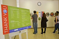
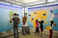
I had the privilege of working with an amazing, large format vendor recently on an installation MORRIS did for the La Jolla Country Day School. This exhibit required a variety of items including large signage, standees (life size cut outs), banners, large walls, clings, street post signage, and magnetic items.
Our vendor, Avi Klinger, owner of Sign It (www.sign-it.com), fit every description listed above. He worked side by side with us on this project every step of the way. He provided personal attention and material samples, brainstormed ideas with us, kept an open and experimental mindset, and his company had the capability of producing EVERYTHING we requested QUICK. Check out the amazing products they produced below (signs, walls, magnets, doors, and standees).


2) Verify the maximum size of the press. Take bleed (color running off the edge of a page) into consideration.
3) Request specifications from your vendor re: file set up and delivery. Knowing how to set up and save your file ahead of time is a crucial, time-saving step.
CONSIDER THIS... when printing banners, large signs or walls (such as trade show graphics) or billboards:
1) Determine the purpose of your banner/sign/wall/billboard. The purpose drives the overall design.
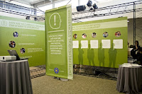
We created several outdoor banners for the installation mentioned above. The purpose of these banners was to inform the public about the upcoming exhibit. They were hung on chain link fences outside of the school for approximately two weeks. We chose a sturdy, weather resistant, vinyl material and used grommets and zip ties to hang the banners. We also selected large, white type that was set off by beautiful bright colors, to catch the attention of drivers as they sped by.
Example :: Indoor Banners
We also created several indoor banners for the exhibit. The purpose of these banners was to announce each separate part of the installation. They were hung from the ceiling on wire cords inside the show for approximately one week. We chose a recycled, lightweight material and used a pole/pocket system to hang the banners. Because the banner was double sided and hung via poles, we had to account for additional banner length (so they could fold and sew the material to create a pocket for the pole) and we were instructed to mirror our design on the bottom portion of the banner to accommodate for the double sided feature. The designs for each of the six banners were branded consistently. They worked in unison, as a family, that helped successfully represent each department of the exhibition.

I remember a meeting where our client was asking us for advice on producing a banner. After walking her through the questions listed above, I can still hear her laughing as she replied, "Who would have thought, ALL THIS went into a simple banner?" I think she chose silver grommets. ;~)
We have skimmed the surface of paper and have even discussed certain press considerations but to gain a further and more complete understanding of the complexity of this process, I have decided to break it down into smaller categories. I plan to post these considerations intermittently and will title each section "CONSIDER THIS..."
Sooooooooooooooo .... CONSIDER THIS... when printing large format items (such as banners, signs, walls, billboards, car and building wraps, standees, etc.)
1) Find a great vendor who specializes in large format printing. If you can find a vendor who has various capabilities, provides stellar service, a quality product at a decent price, and uses cutting edge materials, even better! Request samples of their products and ask lots of questions!
I had the privilege of working with an amazing, large format vendor recently on an installation MORRIS did for the La Jolla Country Day School. This exhibit required a variety of items including large signage, standees (life size cut outs), banners, large walls, clings, street post signage, and magnetic items.
Our vendor, Avi Klinger, owner of Sign It (www.sign-it.com), fit every description listed above. He worked side by side with us on this project every step of the way. He provided personal attention and material samples, brainstormed ideas with us, kept an open and experimental mindset, and his company had the capability of producing EVERYTHING we requested QUICK. Check out the amazing products they produced below (signs, walls, magnets, doors, and standees).


2) Verify the maximum size of the press. Take bleed (color running off the edge of a page) into consideration.
3) Request specifications from your vendor re: file set up and delivery. Knowing how to set up and save your file ahead of time is a crucial, time-saving step.
- What are the accepted file formats (Illustrator, Photoshop, InDesign, pdf, tif, jpeg... etc.)?
- What resolution should you build the file?
- How should you build the file (CMYK)?
- What is the live area?
- Should you outline the fonts?
- Should you embed the images?
- Do they have an ftp site?
- Would they like the file delivered on disc?
- Would they prefer you upload online through their Web site?
- What material is appropriate for this application?
- Do they have recycled materials?
- What are the newest materials on the market?
- Are they available?
- How long will it take to get them?
- What is the weight of the material?
- Is the weight of the material appropriate for this application?
- What is the turnaround on the item(s)?
- Do they provide proofs?
- Is there an additional cost for proofs?
- Can you get a sample printed on the material you requested?
- Is there an additional cost for a sample?
- Can you attend a press check?
CONSIDER THIS... when printing banners, large signs or walls (such as trade show graphics) or billboards:
1) Determine the purpose of your banner/sign/wall/billboard. The purpose drives the overall design.
- Is it a backdrop at a trade show?
- Is it intended to draw attention to an event or company as drivers pass by?
- Is it used as a sign in an art installation?
- Are you using a stand?
- Are you hanging it on a wall, on a fence?
- Will it be hung on existing hardware (such as a billboard or banner stand)?
- Will the existing hardware support the weight of the banner/sign/wall/billboard?
- Do you want grommets? If so, what color?
- Do you want to hang this using a pocket/pole system?
- What type of hardware do you need to hang your banner (hooks, zip ties, wires, poles, glue, special services, etc.)?
- Where will you hang your banner/sign/wall/billboard? Inside? Outside?
- If you are hanging your banner/sign/wall/billboard outside, for how long?
We created several outdoor banners for the installation mentioned above. The purpose of these banners was to inform the public about the upcoming exhibit. They were hung on chain link fences outside of the school for approximately two weeks. We chose a sturdy, weather resistant, vinyl material and used grommets and zip ties to hang the banners. We also selected large, white type that was set off by beautiful bright colors, to catch the attention of drivers as they sped by.
Example :: Indoor Banners
We also created several indoor banners for the exhibit. The purpose of these banners was to announce each separate part of the installation. They were hung from the ceiling on wire cords inside the show for approximately one week. We chose a recycled, lightweight material and used a pole/pocket system to hang the banners. Because the banner was double sided and hung via poles, we had to account for additional banner length (so they could fold and sew the material to create a pocket for the pole) and we were instructed to mirror our design on the bottom portion of the banner to accommodate for the double sided feature. The designs for each of the six banners were branded consistently. They worked in unison, as a family, that helped successfully represent each department of the exhibition.

I remember a meeting where our client was asking us for advice on producing a banner. After walking her through the questions listed above, I can still hear her laughing as she replied, "Who would have thought, ALL THIS went into a simple banner?" I think she chose silver grommets. ;~)
Subscribe to:
Posts (Atom)